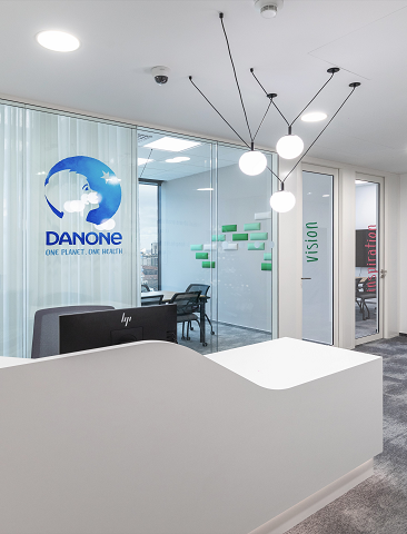

Danone
01 The Opportunity
We were pleased to accept the assignment from client Danone to create a design for their new office and provide project management services as Cushman & Wakefield is their global partner. As some offices during this period, Danone planned to move to a smaller space, changing the working environment from a dedicated desk for each employee to shared workspaces. The benefit was moving to new premises with great views and excellent amenities and accessibility.
Many companies are considering this change these days when you walk into an empty office and see only a few occupied seats, you find yourself wondering if this is an unnecessary waste of both space and resources on office overhead and certainly not a sustainable solution. Working from home has become part of our working setup so our office work needs to be adjusted as well. Focus mainly on collaboration, improving teamwork during the time spent in the office.


"We cooperated with Cushman & Wakefield locally on the second project. We appreciate cooperation with Cushman & Wakefield local team very much. The results more than fulfilled our expectations."
- Hana Zindulková, Logistic Procurement Manager CEE, Danone
02 THE SOLUTION
Therefore, when designing this space, we emphasized that there should be enough secondary working environment such as meeting rooms, phone booths and most importantly a comfortable kitchenette with a café area where it is possible to have a good rest, have an informal meeting or a certain shift to work "on the sofa with your legs splayed out" when sharing workstations.
We haven't forgotten the relaxation corner, where you can reserve a place in a comfortable armchair in a separate room and concentrate fully.
We were very pleased that our client has a positive relationship with greenery in the interior and we were able to move plants from the old office and incorporate them into the interior design as an element that shapes the space and helps to create a relaxing and pleasant atmosphere. We followed up with pale tones, pastel colours, a dreamy rug and natural oak wood colour.
The biggest challenge of the project was the budget. Meeting the design requirements so that the office had quality features, matching colours and materials at the right price point was time consuming, but all the more creative as the final solution was built up gradually and bespoke solutions were sought to the last detail. Such was also the graphic created by the graphic designer for the Bratislava branch of Danone.
A pleasant refreshment during the project was the cooperation with Slovak sheltered workshop from Piešťany. They created for Danone decorative elements for the walls in the meeting rooms, depicting a unique element of corporate identity translated into simple geometry in each meeting room. Here, the company's identity was translated very creatively into an unobtrusive design.